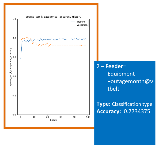
The model outputs a graph called accuracy history vs the epochs (the number of iterations done on the entire data set).
The blue line show accuracy on training data and orange one is for validation data set that was mentioned above. The blue line (training data set) is always better than orange one. The final accuracy report is always on the testing data. Therefore we are reporting the lower bound of accuracies.