General Question

PwrMetrix® allows users to not simply report on system reliability, but to run both prescriptive and predictive analyses using the information found in outage data. It is a proactive investment to reducing the time and effort spent responding to problems. This analysis will help a utility understand:

• Where outages are occurring?
• What are the causes of outages?
• What are the financial costs of outages?
• How past performance can be used to predict future conditions?
• How to develop a plan to make improvements?

PwrMetrix® also produces comparative trends on the nature, location and causes of outages, that allows a utility to see patterns over time. It analyzes cause codes to pinpoint and enumerate the specific causes of outages (such as animals, lightning, vegetation, etc.).

PwrMetrix® also allows a utility to see how it compares anonymously to other utilities in reliability, sorted by utility size and location. It promotes collaboration among utilities regardless of size and system vendors.

PwrMetrix® has US Patent 10,592,564.

In interviews with current users, one theme surfaced again and again: “We realize we are only seeing the tip of the iceberg of the potential ways that we can use this software to help our utility improve service and save money.”

The graphical dashboard reports, including those that overlay outage information on utility system maps, makes information easy to understand for non-technical viewers. It provides management team predictive and prescriptive analysis tool to help in making decisions for mitigating future concerns.

The reports also quickly target problems and illustrate solutions, which is highly valued by CEOs and other senior decision makers. One of the best things cited by active PwrMetrix® users at each utility is the proactive customer support and customization services offered by Aerinet staff.

PROBLEM$149 Billion a Year

For over 100 years, despite electric utility investments, power outages have been increasing in both number and cost. Annual electricity outage cost to the U.S. economy is estimated at $149 Billion. Three words describe the Key challenges: SLOW, COMPLEX & EXPENSIVE as shown on the graphic below.

SOLUTION: US Patent 10,592,564!

In 2012, Aerinet solved these issues and created PwrMetrix®, a transformational and state-of-the art online software-as-a-service (SaaS) that combines real-time benchmarking, artificial intelligence (AI), data analytics, outage cost analysis, GIS visualization, utility social networking and knowledge hub.

From slow, complex & expensive to FAST, SIMPLE & COST EFFECTIVE….

PwrMetrix® empowers engineers, IT, CFOs, CEOs and Board of Directors to make quick decisions and implement changes that lead to saving millions of dollars in avoided outage cost.

PwrMetrix® created a paradigm shift by accelerating the data connectivity, data analytics, AI, business decision making and disseminating knowledge transfer from months or years to minutes and now, in real-time.

PwrMetrix® currently provides visibility at the feeder level, but it is quickly expanding visibility to the individual device level. The next big evolution for PwrMetrix® is to enhance the tool with built-in artificial intelligence (AI). Queries can be written within PwrMetrix® to shine a light on trends and conditions that can aid in making predictive, rather than reactive, analyses of seasonal system changes.

Once the machine learning properties of AI are added to the PwrMetrix® software, trends will be spotted, followed and analyzed automatically, without the need for queries submitted by utility personnel. Following the addition of AI, PwrMetrix® can more easily utilize other datasets within the utility domain. For example, new applications for PwrMetrix® will include predicting and adapting to the changing ways customers use energy, such as the impacts of electric vehicle charging, or customer-sited solar and battery storage.

PwrMetrix® is presently used by 230+ electric utilities worldwide (and growing).

Artificial intelligence (AI)

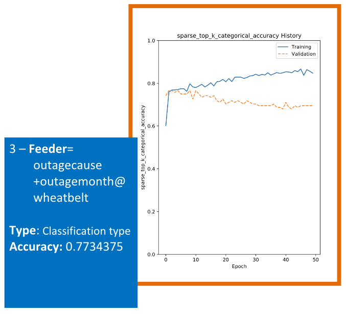
The model outputs a graph called accuracy history vs the epochs (the number of iterations done on the entire data set).

The blue line show accuracy on training data and orange one is for validation data set that was mentioned above. The blue line (training data set) is always better than orange one. The final accuracy report is always on the testing data. Therefore we are reporting the lower bound of accuracies.

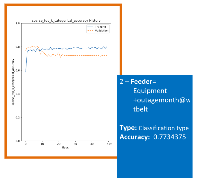
For predictions we have two types of modeling, a regression type and classification type.
Regression modeling deals with predicting “y” values that are continuous like age, outage_cost, outage_minutes while classification modeling deals with predicting “y” values that are discrete (nominals) like gender, outage month, feeder etc.

In regression the accuracy often used is Mean Absolute Error which gives out the average of error calculated as the difference between actual value and predicated value.

In classification the accuracy often used is the percentage of correct values.

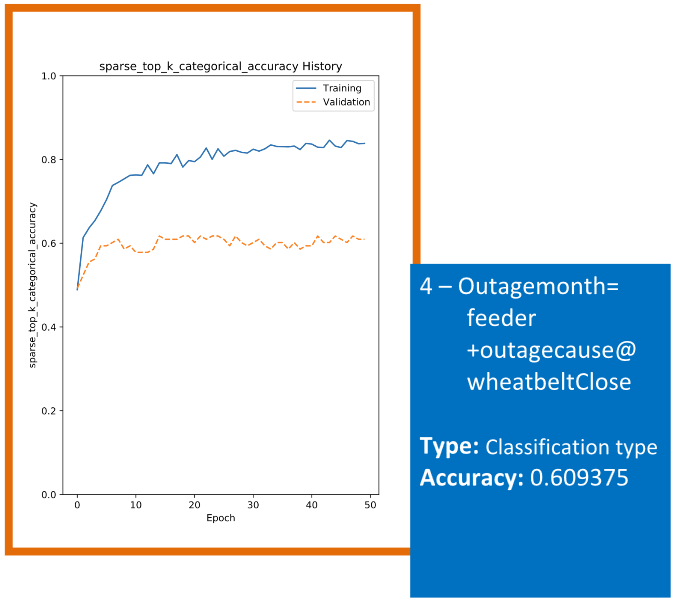
All accuracy calculations are based on a 10 percent of data set that model sets aside and therefore, does not see during modeling for a more regroups measurement. The accuracy is often much higher if one uses the same data during modeling! 

Here are some reports on a few predictors:

  • Some are really good (device=hourlywindspeed+feeder+outagemonth with accuracy of 0.979)
  • Some are good (feeder=equipment+outagemonth@wheatbelt with acc of 0.773)
  • Some are not so good (outagemonth=feeder+outagecause@wheatbelt acc of 0.66)

Lower Acc often means either:

  • the data is noisy,
  • the designated features (x) and the designated response (y) are not relatable, and or
  • too few or too many features

In the given data set, no matter how hard the model tries…

All the predictors must go through a fair amount of analysis to make sure they are worthy of release
to production. What we did in the demo is a partial work.

Here is a sample of few…